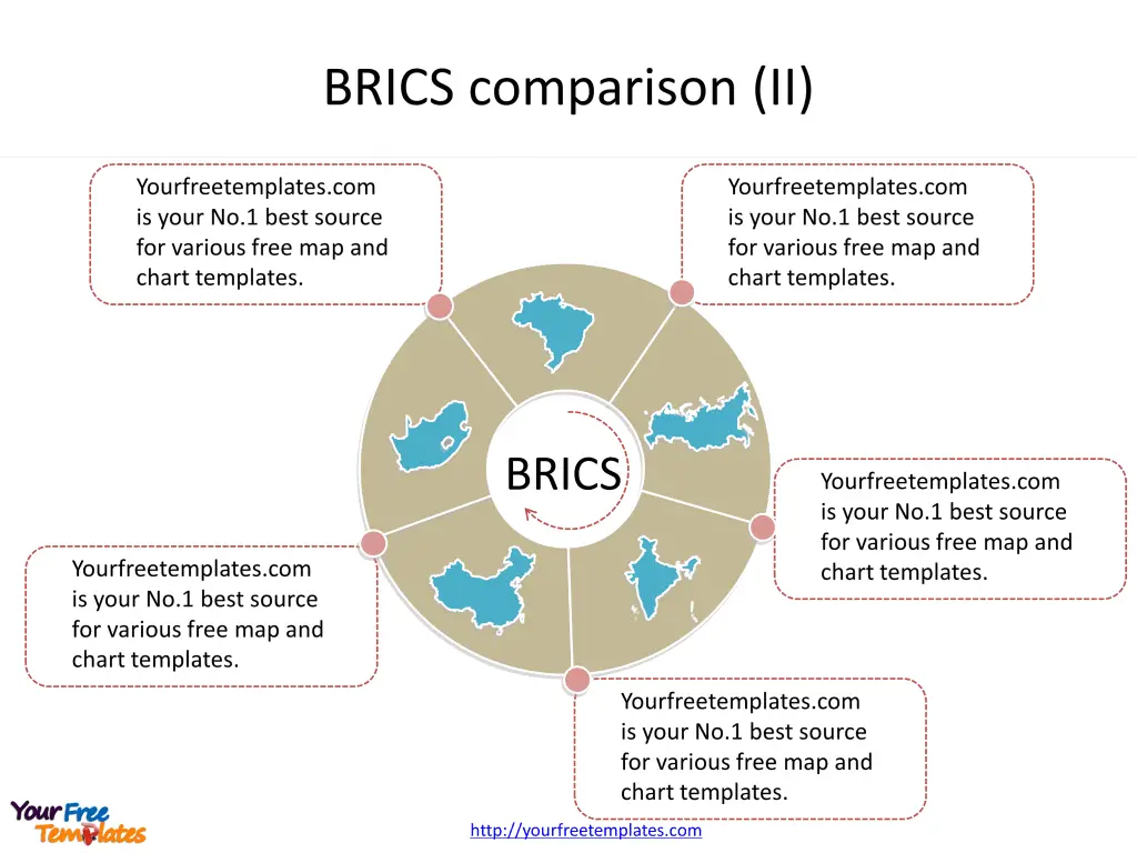
Slide 5, Create maps with Doughnut chart enhancing the effect.
The Doughnut chart type is similar to the Pie chart type, except that it has a hole in the center. Doughnut chart can be substitute based on the numbers of countries. You can choose other diagram with map icons to give the slide a different look.

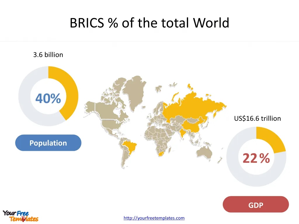
Slide 6, Create maps with Pie charts highlighting BRICS shares.
A pie chart (or a circle chart) is a circular statistical graphic which is divided into slices to illustrate numerical proportion. Only BRICS countries are marked and others are filled with grey color. This is another way to associate map with data. As of 2015, the five BRICS countries represent over 3.6 billion people, or about 41% of the world population; all five members are in the top 25 of the world by population, and four are in the top 10. The five nations have a combined nominal GDP of US$16.6 trillion, equivalent to approximately 22% of the gross world product.

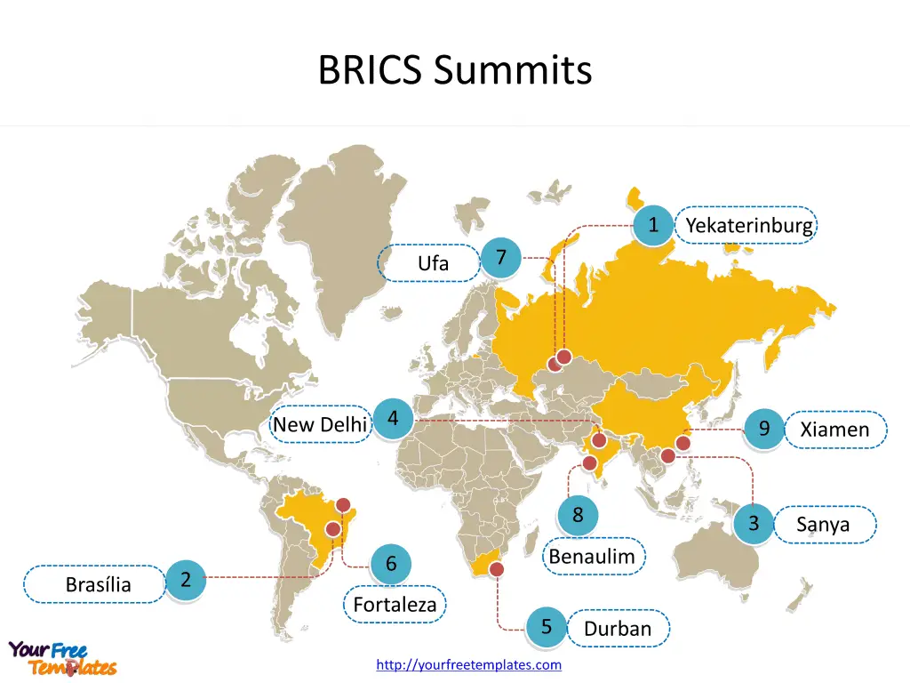
Slide 7, Label different places in the world map one by one.
Create maps with lots of locations and labels are difficulty, but you can use the guidelines to clearly label the places. The grouping has held annual summits since 2009, with member countries taking turns to host. Prior to South Africa’s admission, two BRIC summits were held, in 2009 and 2010. The first five-member BRICS summit was held in 2011. The most recent BRICS summit took place in Xiamen, China, from 3 to 5 September 2017.

Size:1.47M
Type: PPTX
Aspect Ratio: Standard 4:3
Click the blue button to download it.
Download the 4:3 Template
Aspect Ratio: Widescreen 16:9
Click the green button to download it.
Download the 16:9 Template


