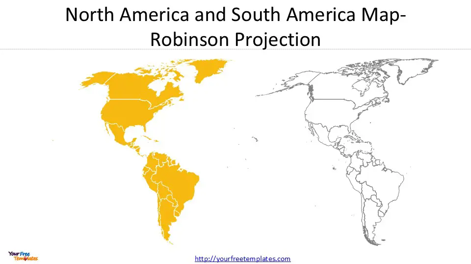
Maps are powerful tools for visualizing geographic data, but the way a map is projected can dramatically affect how we perceive the world. At Yourfreetemplates.com, we offer customizable templates of South and North America Maps in three popular projections:
- Robinson Projection – A balanced, aesthetically pleasing world map.
- Mercator Projection – Ideal for navigation but distorts size at high latitudes.
- Equal Earth Greenwich Projection – An equal-area alternative that keeps landmasses proportionally accurate.
Each projection comes in two styles:
- Color Shapes by Country (for political or demographic data)
- Uniform Color (for clean, minimalist designs or custom overlays)
At the end of this post, you can download our South and North America Maps vector boundary PowerPoint template to create customized slides in your project. As the same diagram PowerPoint template series, you can also find our Top Cities in Kentucky State,12 Best Countries to Retire in 2025, 21 Best Cities to Live in the United States, 17 Best Cities in the World for 2025, 23 Best American Cities to Visit in 2025, World Cup Cities PowerPoint templates.
Let’s explore these projections and their best use cases.

1. Robinson Projection: A Balanced View of South and North America Maps
The Robinson projection is a compromise projection that minimizes distortion in shape, area, and distance. While not perfectly accurate in any single aspect, it provides a visually appealing representation of the Americas.
Why Choose the Robinson Projection?
✅ Best for general-purpose maps (e.g., educational materials, atlases).
✅ Smooth, rounded appearance without extreme distortions.
✅ Balanced representation of North and South America.

Our Robinson Projection Templates
- Color by Country: Perfect for political maps, showing borders and country distinctions.
- Uniform Color: Great for thematic overlays (e.g., climate zones, trade routes).
Example Use Case:
A geography teacher uses the Robinson color-by-country map to explain the political divisions of the Americas, while a travel blogger uses the uniform-color version to highlight a backpacking route across the continent.


