As a geography enthusiast, I find maps and their projections fascinating. With the United States being one of the most popular countries in the world, it’s interesting to see how different map projections can change the way we perceive the country’s shape and size. In this article, I will guide you through different USA map outlines and their projections, highlighting their pros and cons, and help you choose the right one for your needs. Most important of all, the USA outline of 8 map slides to be downloaded for applications in your study and work. If you want the US map by states in the four projections, please check the blog, US map projection types.
What is a Map Outline?
Before we start exploring different USA map outlines, let’s first understand what a map outline is. A map outline, also known as a map projection, is a way of representing a three-dimensional globe on a two-dimensional surface. Since the Earth is round and maps are flat, there is always some distortion in the way a map represents the world. Different projections have different ways of dealing with this distortion, resulting in different shapes and sizes of countries and oceans on the map.
Understanding USA Map Outlines: Different Projections
There are primarily four different map projections used to represent the United States outline, each with its own strengths and weaknesses. In this section, we will discuss some of the most popular USA map outlines:
- US National Albers Equal Area Conic
- Continental US Mercator Projection
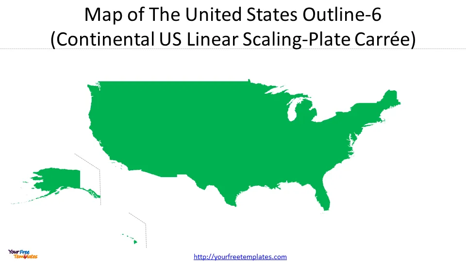
- Continental US Linear Scaling-Plate Carrée
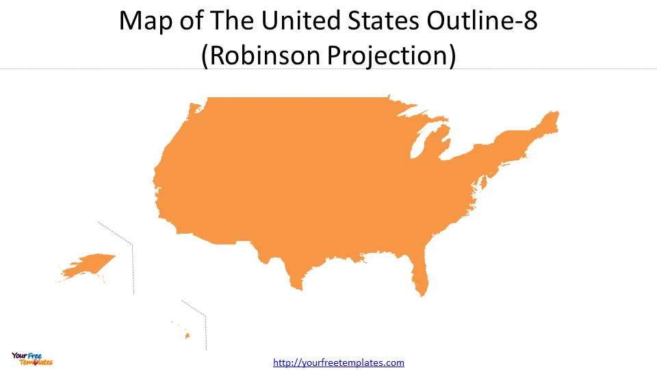
- Robinson Projection
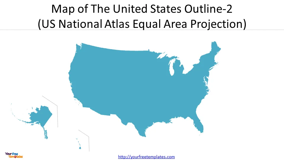
Albers Equal Area Conic Projection: Pros and Cons
The Equal Earth Projection is a new equal-area projection that accurately represents the size and shape of landmasses. It is a compromise projection that balances the distortion of size and shape and is gaining popularity among cartographers and geographers.
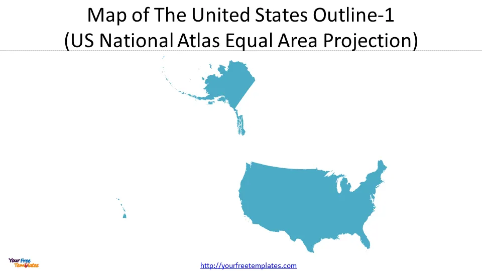
One of the biggest advantages of the Equal Earth Projection is that it accurately represents the size and shape of landmasses. This makes it useful for general reference and educational purposes, especially for the traditional US map display most people get used to.
This projection is best suited for land masses extending in an east-to-west orientation rather than those lying north to south. It is used for small regions or countries but not for continents. The U.S. Geological Survey (USGS) has adopted the projection for the conterminous United States outline.
Mercator Projection: Pros and Cons
The Mercator Projection is one of the most well-known map projections and is often used on world maps. It is a cylindrical projection that preserves the shape of landmasses but distorts their size towards the poles. This means that countries like Greenland and Russia appear much larger than they are, while countries near the equator appear smaller. The Mercator Projection is useful for navigation but can give a skewed perception of the world.
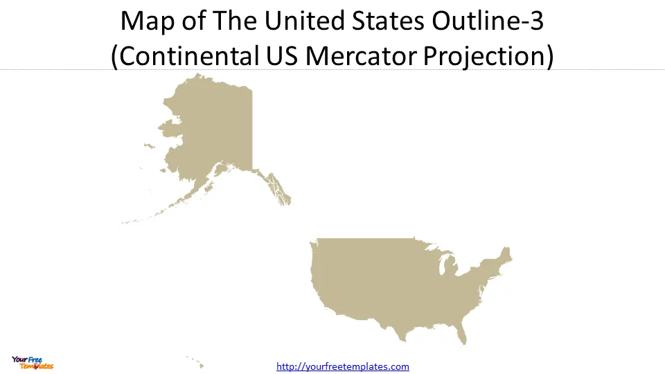
One of the biggest advantages of the Mercator Projection is that it is conformal, meaning that it preserves angles and shapes. This makes it useful for navigation and measuring distances. However, it distorts the size of countries and oceans near the poles, making them appear much larger than they actually are.
Google has used the Mercator Projection to show the maps, so it has also gained popularity for presenting US large landmass, United States outline.
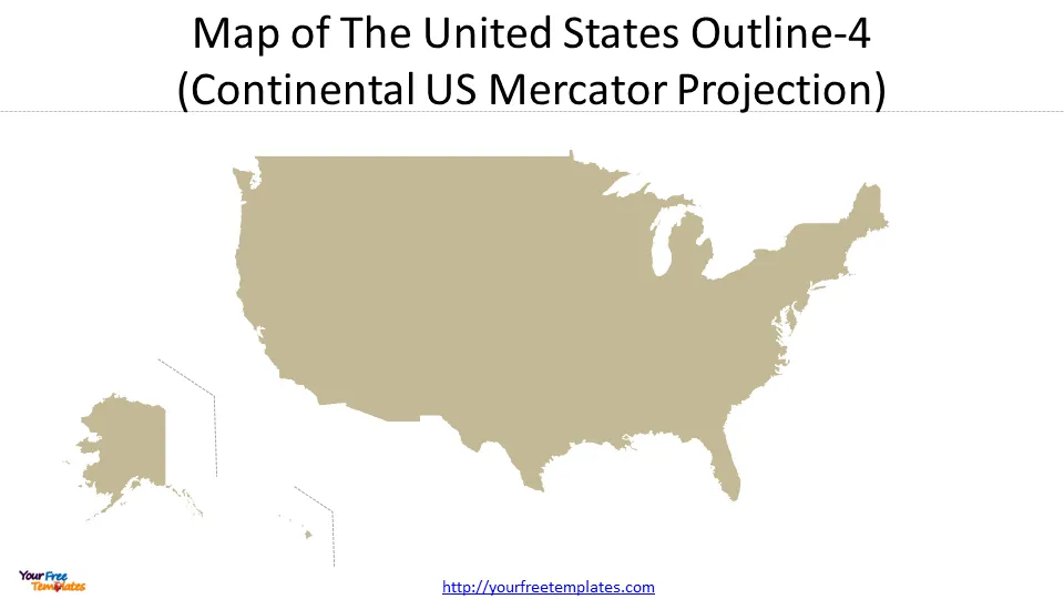
Plate Carrée Projection: Pros and Cons
The Plate Carrée projection is a simple mapping technique that represents the Earth’s surface as a flat plane. It is also known as the equirectangular projection. The projection is easy to create and is commonly used for world maps and data visualizations. However, it has some drawbacks.
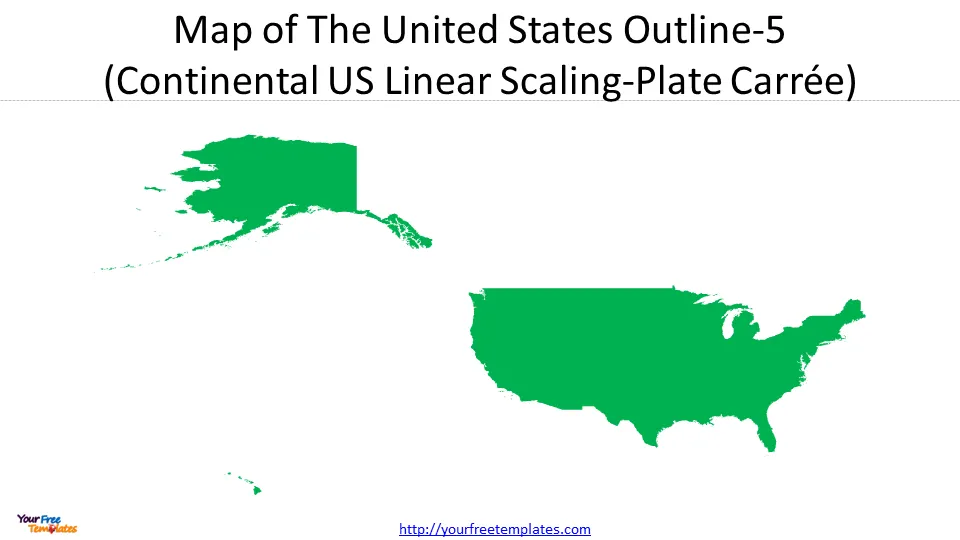
One of the main disadvantages is that the projection distorts the size of objects as you move towards the poles. This can make it difficult to accurately represent land masses and can lead to misinterpretation of data. Additionally, the projection does not preserve angles and shapes, which can make it challenging to create accurate maps for navigation purposes.
Although Plate Carrée Projection is like Mercator projection, it is slightly pushed inward with the stretched view of the continental United States.
Robinson Projection: Pros and Cons
The Robinson Projection is a compromise projection that balances the distortion of size and shape. It is a pseudocylindrical projection that curves the meridians towards the poles, resulting in a more pleasing visual aesthetic. The Robinson Projection is often used in educational materials and atlases.
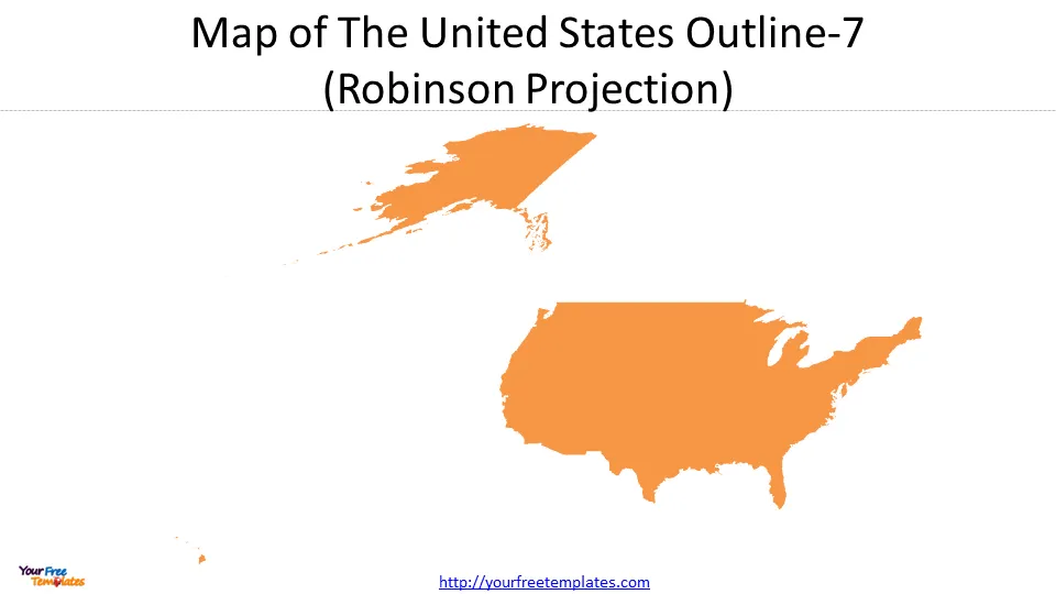
One of the biggest advantages of the Robinson Projection is that it is a compromise between size and shape. This makes it useful for general reference and educational purposes. However, it still distorts the size and shape of landmasses, making it less useful for accurate measurements and comparisons.
Choosing the Right USA Map Outline for Your Needs
When choosing the right USA map outline for your needs, it’s important to consider what you will be using the map for. If you need a map for understanding the US in the global background or to be familiar by most people, the Albers Equal Area Conic may be more suitable. If you need a map for navigation or measuring distances, just like Google used on the web, or choose the projection for the single US state, the Mercator Projection may be the best choice. If you need a map for general reference or educational purposes, the Robinson Projection may be the best choice. The Plate Carrée projection is for Continental US Linear Scaling. The last two projections are applied for scientific purposes.
Conclusion: The Fascinating World of United States Outline
In conclusion, the world of USA map outlines is fascinating and full of different projections that each have their own strengths and weaknesses. By understanding these projections and their uses, we can choose the right map outline for our needs and gain a more accurate understanding of the US map. Whether you’re a geography enthusiast or just someone who needs a map for a specific purpose, exploring the different USA map outlines can be a rewarding and enlightening experience.
For other interesting maps, pls visit our ofomaps.com
Size:852K
Type: PPTX
Aspect Ratio: Standard 4:3
Click the blue button to download the maps.
Download the 4:3 Template
Aspect Ratio: Widescreen 16:9
Click the green button to download the maps.
Download the 16:9 Template


