
Looking for an Equal Earth world map download that is clean, editable, and suitable for presentations, geography projects, data visualization, or map design?
This page provides a three-slide Equal Earth world map PowerPoint template with progressively different levels of detail:
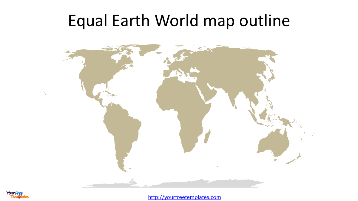
- Equal Earth World Map Outline – a clean world map showing country boundaries.
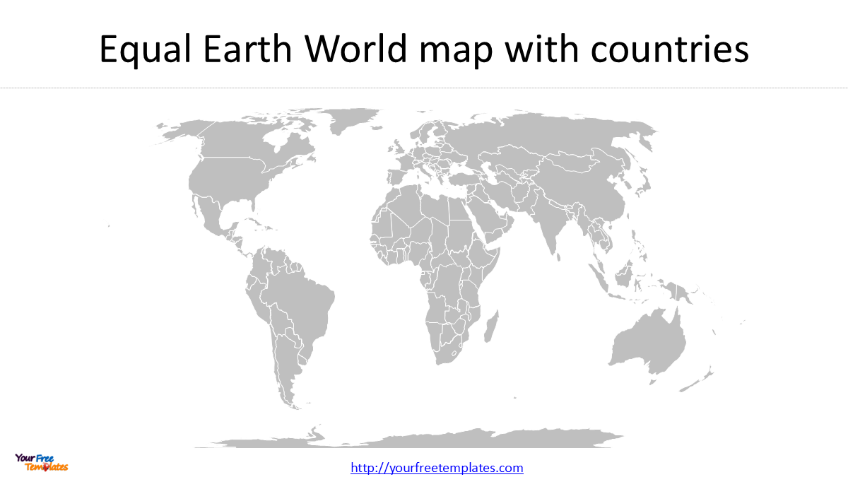
- Equal Earth World Map with Countries in One Color – useful as a simple geographic reference map.
- Equal Earth World Map with Countries in Different Colors – suitable for highlighting countries, regions, groups, or other geographic categories.
The maps are designed to be edited in PowerPoint, so you can change colors, add labels, remove selected countries or geographic features, and customize the map for your own presentation.
Download the Equal Earth World Map PowerPoint Template
Download the free Equal Earth World Map PowerPoint template to get all three editable slides.
The template uses the Equal Earth projection (EPSG:8857) and is based on country boundary data from Natural Earth.
[Download the Equal Earth World Map PowerPoint Template]
What Is the Equal Earth Projection?
The Equal Earth projection is a pseudocylindrical, equal-area world map projection designed to show the relative sizes of continents and countries more accurately while maintaining a visually balanced appearance.
For a world map, this is particularly useful when the purpose is to compare land area, geographic distribution, population patterns, economic regions, or other country-level data.
The Equal Earth projection is identified in the EPSG Geodetic Parameter Dataset as EPSG:8857 – WGS 84 / Equal Earth Greenwich. Its scope is very-small-scale equal-area mapping, with worldwide coverage.
One important characteristic of an equal-area projection is that the relative area of geographic features is preserved. This does not mean that shapes, distances, or directions are perfectly preserved. In fact, no projection can preserve every geographic property simultaneously.
That trade-off is one reason why different world map projections continue to be used for different purposes.
Why Use Equal Earth Instead of Mercator for a World Map?
The Mercator projection was originally developed for navigation because it preserves local angles and allows lines of constant bearing to be represented as straight lines. However, it significantly enlarges areas at high latitudes.
For example, Greenland can appear visually much larger than its actual area relative to Africa. This makes Mercator extremely useful for certain navigation applications, but less suitable when the primary objective is to compare the actual relative areas of continents and countries.
Equal Earth takes a different approach: it preserves relative area while providing a visually balanced representation of the entire world.
A recent United Nations development
This issue has received renewed international attention in 2026.
On September 4, 2026, the United Nations General Assembly adopted a resolution titled “Correct the Map: Rebalancing Global Representation and Promoting Equitable Representation of the World’s Regions, Particularly Africa.” The resolution passed with 164 votes in favor, 1 against, and 6 abstentions.
The resolution encourages governments, international organizations, educational institutions, and other stakeholders to promote map projections that represent the relative size of continental land areas more accurately. Equal Earth is specifically mentioned in the discussion surrounding the resolution.
However, it is important to clarify that the United Nations did not ban or formally abandon the Mercator projection. The resolution recognizes that different projections serve different purposes and does not impose one projection for all applications. Navigation remains an important use case for projections such as Mercator.
Therefore, for a general-purpose world map where relative country and continent size is important, Equal Earth provides an attractive alternative to Mercator.
Natural Earth Data: The Source Behind the Map
The country boundaries used for this Equal Earth world map are based on Natural Earth, a widely used free geographic dataset designed for cartographic production.
Natural Earth provides vector and raster map data at three main scales:
- 1:10m – detailed
- 1:50m – moderate detail
- 1:110m – small-scale / simplified
For a clean world map intended for PowerPoint presentations, the 1:110m Cultural Vectors – Admin 0 Countries dataset is particularly useful.
Natural Earth 1:110m Admin 0 – Countries
Natural Earth describes the Admin 0 Countries dataset as a country-level dataset containing 258 country units and notes that it is the dataset most users will want when creating a world country map.
The 1:110m dataset is deliberately generalized, which means it contains fewer vertices and less geographic detail than the 1:10m dataset. This is an advantage when your goal is a simple presentation map rather than a highly detailed GIS map.
Natural Earth also explains that its data are intended for cartographic production and that the different scales allow users to select an appropriate level of geographic detail.
Why use 1:110m for a PowerPoint world map?
A highly detailed country boundary dataset can create thousands of unnecessary vertices and tiny islands. When converted to SVG or PowerPoint, this can make the file heavier and the map more difficult to edit.
The 1:110m scale provides a simpler country outline, making it a good starting point for:
- PowerPoint world maps
- presentation slides
- educational maps
- infographic design
- country comparison maps
- simple geographic visualizations
If you need more geographic detail, Natural Earth also provides the 1:50m and 1:10m datasets.
Three Equal Earth World Map Styles Included
Slide 1: Equal Earth World Map Outline
The first slide provides a clean country-outline world map.
This version is useful when you want the geography itself to remain visually unobtrusive. You can add your own:
- country labels
- city locations
- arrows
- annotations
- data symbols
- regional boundaries
Because the country shapes are editable, the map can also be simplified further for your particular presentation.
Slide 2: Equal Earth World Map with Countries in One Color
The second slide uses the same Equal Earth geography but displays the countries using a consistent color scheme.
This creates a cleaner visual hierarchy and works well as a base map for adding your own information.
For example, you can overlay:
GDP → population → trade → climate → natural resources → regional groups → business locations
without having the base map compete with your data.
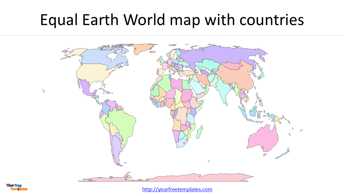
Slide 3: Equal Earth World Map with Countries in Different Colors
The third slide assigns different colors to countries.
This is useful when the purpose is to distinguish geographic groups.
For example, you could use different colors for:
- continents
- economic regions
- political groups
- trading blocs
- geographic regions
- custom business territories
- countries included in a particular analysis
Because the countries remain separate editable shapes, you can change the colors directly in PowerPoint.
You Can Remove Antarctica If You Don’t Need It
One practical advantage of an editable vector world map is that you don’t have to keep every geographic feature.
For many business presentations, classroom maps, and infographic designs, Antarctica is not necessary.
Because the map is constructed from individual geographic shapes, you can remove Antarctica from the slide if you want a more compact world map focused on the populated continents.
This can also improve the visual balance of a presentation because Antarctica occupies a relatively large area at the bottom of many world-map projections while containing very little information relevant to ordinary country-level analysis.
You can similarly remove or simplify other features that you do not need.
Equal Earth vs. Mercator: Which One Should You Use?
There is no single projection that is best for every purpose.
| Feature | Equal Earth | Mercator |
|---|---|---|
| Relative area | Preserved | Strongly distorted at high latitudes |
| Shape | Compromise | Locally conformal |
| Navigation | Not designed for navigation | Excellent for many navigation applications |
| Global area comparison | Well suited | Less suitable |
| World presentations | Well suited | Common but visually enlarges high latitudes |
| Thematic maps | Useful for area-based data | Depends on purpose |
| Country size comparison | Useful | Can be misleading visually |
The choice should therefore depend on what you want the map to communicate.
If the purpose is navigation, Mercator may remain appropriate.
If the purpose is comparing the relative size of countries and continents, an equal-area projection such as Equal Earth can be a better fit.
The recent UN resolution similarly emphasizes that map projections have different characteristics and uses rather than declaring one projection universally correct.
You can check our World map in Mercator projection below.
- 7 World Map Regions: Simple Guide to All 195 Countries (2025 Edition)
- World Map Outline in 7 Projections
- World maps Template with Six Continents
- World map with Continents
- World Map free powerpoint templates
Why This Equal Earth World Map Is Useful for PowerPoint
A conventional image of a world map can be difficult to edit once it has been inserted into PowerPoint.
An editable vector map is different.
You can:
- change individual country colors
- delete countries or geographic features
- add labels
- highlight selected countries
- create regional groups
- add data visualization
- modify outlines
- resize the entire map
- use the map as a presentation background
This makes an editable Equal Earth world map PowerPoint template useful for presentations, reports, education, business analysis, geography, and data visualization.
Equal Earth World Map Download
If you need a clean world map that emphasizes the relative size of countries and continents, this Equal Earth world map download provides three editable PowerPoint versions:
Slide 1: Equal Earth country outline
Slide 2: Equal Earth countries with a consistent color
Slide 3: Equal Earth countries with different colors
Looking for Premium maps, please visit our affiliate site: https://editablemaps.com/ or https://ofomaps.com/
Size:490K
Type: PPTX
Equal Earth World Map Template
Click the link to download it.
Aspect Ratio: Widescreen 16:9
Click the green button to download it.
Download the 16:9 Template
The map is based on Natural Earth 1:110m country data and uses WGS 84 / Equal Earth Greenwich (EPSG:8857).
Download Natural Earth 1:110m Country Data
For users who need an editable world map for PowerPoint, this provides a simple starting point that can be customized without rebuilding the geography from scratch.